Police shootings data analysis
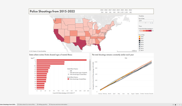
At the end of summer 2022 I joined a Tableaux data visualization competition. I chose to analyze the raw data of police shootings from 2015-2022. The result I created was awarded 1st place, and this is what I made.
Project Date: August 2022
Project Timeline: 2 weeks
This data was collected from:
https://www.kaggle.com/datasets/ramjasmaurya/us-police-shootings-from-20152022
The commentary can be continued at the Washington Post https://www.washingtonpost.com/graphics/investigations/police-shootings-database/
Created with
Process breakdown
1
Understanding Data
The first step of understanding data is cleaning up the raw data. Using the data dictionary I put the coded terms into more human friendly data points.
2
Generating Graphs
Once the data is readable, the next step is addressing what needs to be investigated and what type of visualization makes the most sense.
3
Merging into Dashboards
After each graph is created they need to be placed in groups on dashboards to become true infographics.
4
Results and Reflection
There's always something that could be added. While my work earned me 1st place, I found areas I would add to my report if given a second chance.
Gathering data

Lots of unfiltered code and non human friendly data to be cleaned up
The dataset was pulled from Kaggle.com. Being filled with raw data it was up to me to turn the abbreviations into complete words for the end product.
Raw graphs
Auto-generated colors and graph keys
The dataset was pulled from Kaggle.com. Being filled with raw data it was up to me to turn the abbreviations into complete words for the end product.
Bringing home the gold
My end product merged my 7 graphs into 4 total dashboards that were used to illustrate different statistics about the recorded shootings.
As a reward for my stellar visualizations, I won some free merchandise and a gift card!
The filters on the side are clickable too
Judge panel comments
Shortcomings
The judges highlighted many of the areas I felt I could have taken a step further.
Narrative
I spent a lot of space representing the data. Turning these points into a story could make more viewers care about the data. Data without a story is relevant but weak.
Population as %
This data would be best represented through the use of proportions and percentages of the state population rather than raw population counts. As mentioned by one of the Judges.
Design
While better than the other submissions I still feel like this array of visualizations is limited. Portions of the design still feel semi-professional rather than publishable.
Time extension
Many of these shortcomings are a result of this being made in 2 weeks. The best thing I could be given to make better work would be a larger heads up and overall time table.


